




Fundraising thermometers and donation progress bars both tap into powerful psychological triggers, like the Goal Gradient Effect and social proof, to boost donor motivation and increase conversion rates. But the best choice depends on your audience, campaign type, and device usage.
Use a fundraising thermometer for community-driven efforts like church drives, school fundraisers, or capital campaigns, where its vertical, nostalgic design builds emotional momentum.
Opt for a donation progress bar on modern nonprofit websites, crowdfunding pages, or mobile-first donation flows, where its horizontal, minimalist layout enhances usability without sacrificing impact.
Use both if you want to hedge your bets, and it doesn’t hurt conversion.
The rest of this guide breaks down exactly why each one works, when to use which, and how to set one up on your WordPress site without damaging your donation conversion rate.
A Quick Glance At Fundraising Thermometer vs Progress Bar
Before diving deeper into each fundraising visual element, take a look at its summarized comparison below.
| Feature | Fundraising Thermometer | Donation Progress Bar |
| Visual style | Vertical, classic “mercury rising” look | Horizontal, modern loading-bar look |
| Best for mobile | Can feel cramped on small screens unless optimized | Adapts naturally to narrow, mobile layouts |
| Best campaign types | Events, church drives, school fundraisers, capital campaigns | Tech-savvy donor bases, crowdfunding, recurring giving, modern nonprofit sites |
| Modern design feel | Traditional, nostalgic | Sleek, contemporary |
| Emotional tone | High excitement, physical/tactile | Clean, frictionless |
| Customization | Colors, milestones, labels | Colors, gradients, percentage/label display |
| Non-monetary tracking | Less common (mainly dollar goals) | Works well for donor counts, volunteer hours, item drives |
Both formats can display the current amount raised, the goal amount, and progress as a percentage. The differences come down to shape, placement, and the feeling each one creates.
Fundraising Thermometer vs Progress Bar: What are They?
At first glance, a fundraising thermometer and a progress bar might seem like the same thing – they both track fundraising progress. However, their design, presentation, and impact on donor engagement can differ significantly. Before deciding which one fits your campaign, let’s take a closer look at what each is and how it works.
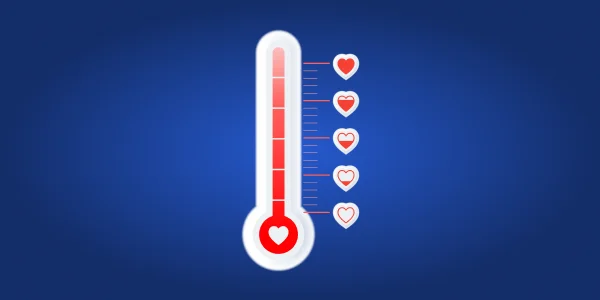
What Is a Fundraising Thermometer?
A fundraising thermometer is a visual tracker shaped like a classic vertical temperature gauge. As donations come in, the “mercury”, which is usually a colored bar, rises toward the top, showing how close a campaign is to its goal.
How It Works
The thermometer displays three core data points, namely; the amount raised so far, the total goal, and often the percentage completed.
As the fill line climbs, it visually communicates momentum in a way that feels almost physical.
Best Use Cases
- Church and community fundraising drives
- School and PTA campaigns
- Capital campaigns (building funds, renovations)
- In-person events like galas or telethons, where a large printed or digital thermometer can be updated live
- Giving Tuesday and other short, high-energy pushes
Pros
- Instantly recognizable and easy to understand at a glance
- Creates a strong emotional, physical sense of progress
- Works well as a large, eye-catching centerpiece on a landing page
- Easy to display physically at in-person events
Cons
- Takes up more vertical space, which can be awkward on mobile
- Can feel dated on modern, minimalist websites
- Less flexible for narrow placements like sticky bars or email headers

What Is a Donation Progress Bar?
A donation progress bar serves the exact same function as a thermometer but uses a horizontal design which is quite similar to the loading bar you see when any app is starting up. It’s sometimes called a goal meter.
How It Works
Like the thermometer, the bar fills from one side to the other as donations accumulate, displaying the current amount, the goal, and often a percentage. Because of its shape, it slots easily into narrow or horizontal spaces.
Read More 👉 : How to Set Up Donation Progress Bar.
Best Use Cases
- Modern nonprofit and SaaS-style donation pages
- Crowdfunding campaigns
- Recurring donation or membership drives
- Sticky footers, floating banners, and email headers
- Mobile-first websites
Pros
- Fits naturally into compact or mobile layouts
- Reads as clean and modern, matching contemporary web design
- Versatile enough to track non-monetary goals as well
- Easy to embed in tight UI spaces without disrupting layout
Cons
- Can feel less “exciting” or visually dramatic than a thermometer
- Smaller footprint means it’s easier to overlook if not placed prominently
- Less traditional feel, which may not suit nostalgic or community-driven campaigns
Why Add a Fundraiser Thermometer or a Progress Bar in WordPress?
Adding a visual progress tracker to your WordPress donation page is one of the quickest ways to encourage giving. These simple graphics tap into human psychology to drive your campaign forward and boost your results. Research shows that nonprofits using visual progress indicators see an average 18% increase in donation completion rates compared to those that don’t.
Here are more reasons why to add visuals:
- Drives action to the finish line: A study in the National Institutes of Health (NIH) showed that visual progress indicators can increase completion rates by up to 40% for goal-directed activities.
- Provides social proof: These visuals show potential donors that others are already contributing. When people see that a campaign has momentum, they are more likely to join in, feeling like they are part of a winning team.
- Increases donor engagement: Campaigns with visual progress indicators can boost donor engagement by up to 30%, according to NonprofitSource. Seeing the bar rise reinforces that every donation is making an impact.
- Creates urgency: As the thermometer or the progress bar gets closer to the goal line, it creates a powerful sense of urgency. Donors are more likely to help push the campaign over the finish line when they see the goal is just shy of completion, especially when a deadline is approaching.
The Psychology Behind Both Visuals
The phenomenon is known as the Goal Gradient Effect.
Goal Gradient Effect states that people’s motivation to complete a goal increases the closer they get to it, just like sprinting when you can see the finish line.
When donors see the progress bar near 80% or 90%, they feel a stronger, subconscious urge to donate and “complete” the goal, much like running faster when you see the finish line in a race.
- Social Proof. A visual that shows other people have already contributed reduces the perceived risk of giving. Donors are comfortable joining something that already looks successful.
- Completion Bias. Once people see a task is partially done, there’s a psychological pull to finish it – the exact reason an 80% complete progress ring feels compelling.
- Endowed Progress Effect. Campaigns that start pre-filled (even artificially, through early or seed donations) feel closer to completion than they actually are.
- Urgency. As the visual nears the goal, the perceived cost of not acting rises, prompting faster decisions.
- Herd Behavior. Momentum is contagious. A visibly active campaign signals that “this is working,” which draws in donors who might otherwise sit on the fence.
Importance of Visual and Placement
Because thermometers and progress bars rely on identical psychological mechanics, the deciding factor is the visual:
- Visible and prominent
- Kept current
- Paired with a clear goal and a strong call-to-action
- Suited to the device most of your donors are using
A beautifully designed thermometer that’s buried at the bottom of a page will underperform a simple progress bar placed right next to the donate button. Placement and upkeep matter more than which shape you pick.
When to Choose a Fundraising Thermometer
- Small church fundraiser → the nostalgic, communal feel of a thermometer fits the tone, especially if it’s displayed in the lobby and updated weekly.
- School campaigns → thermometers are visually simple for younger audiences and parent communities to understand at a glance.
- Community fundraising drives → a large printed or digital thermometer works well at local events.
- Capital campaigns → big, long-term goals (like a building fund) benefit from a bold, dramatic visual that can be updated over months or years.
- Giving Tuesday and short-term event pushes → the vertical format creates urgency well when displayed prominently on a landing page.
When a Progress Bar Is the Better Choice
- Modern nonprofit websites → clean, minimalist sites tend to look better with a sleek horizontal bar than a vertical graphic.
- WordPress donation pages → bars integrate easily into page builders and theme layouts without disrupting design.
- SaaS-style donation platforms → where a “goal meter” UI pattern already feels native to users.
- Crowdfunding campaigns → most crowdfunding platforms already use bars, so donors expect this format.
- Membership and recurring donation drives → bars work well for tracking things like “members needed” rather than a single dollar figure.
- Mobile-first audiences → if most of your traffic comes from phones, a horizontal bar avoids awkward vertical scaling.
Can You Use Both Together?
Yes. Displaying a thermometer and a progress bar on the same campaign isn’t redundant; it lets you cover different placements and different visitor preferences without conflict.
Pros of using both:
- Covers both desktop (thermometer as a landing-page centerpiece) and mobile/narrow spaces (bar in a sticky footer or email)
- Reinforces momentum through repetition across the page
- Appeals to different visual preferences among donors
Cons of using both:
- Requires keeping two visuals updated and in sync – an outdated one undermines trust
- Can clutter the page if not spaced out thoughtfully
- Slightly more setup work, depending on your plugin/tooling
Fundraising Thermometer vs Progress Bar: Which One Is Better?
When you compare a fundraising thermometer versus a progress bar, neither one is technically “better” than the other. Both visuals achieve the exact same function: tracking and displaying your goal progress. Their effectiveness relies on the same core human psychology, which means they are functionally equal in boosting donor motivation.
Both visuals rely on the psychological principle of the Goal Gradient Effect to drive action. This simply means people are more motivated when they are close to finishing a goal. Because they operate identically on a psychological level, the “best” choice is the one that aligns with your brand’s style and where you intend to use it.
A classic thermometer is great for traditional campaigns or an annual event. A progress bar, however, is a modern, flexible choice.
For example, if you want a visual in a narrow space, like a sticky floating bar or within an email header, the horizontal progress bar is the superior choice. If your goal is a large, exciting visual on a landing page, the vertical thermometer often captures more attention. Therefore, you should select the visual that best fits your website’s design and the specific placement you have chosen for maximum visibility.
How to Add a Fundraising Thermometer or The Progress Bar
WordPress doesn’t include a native way to display a fundraising progress bar or thermometer, so you’ll need a plugin for either option.
While WP EasyPay offers built-in progress bars for WordPress (premium only), several other trusted tools provide similar functionality:
- GiveWP (free + premium): native progress tracking with accessibility support
- Donorbox: embeddable progress meters with recurring donation logic
- Raisely: dynamic thermometers with milestone celebrations
Always test plugins for real-time syncing, mobile responsiveness, and WCAG compliance before committing.
For this article, we are using the WP Easy Pay plugin because this plugin enables you to easily add customizable payment forms and visualize your fundraising goals on any page. The plugin offers other amazing benefits as well; let’s discuss them later, and for now, we can focus on adding the progress bar to your WordPress site.
⚠️ WP EasyPay Premium will not work with the free version installed. Ensure that you disable it before proceeding with the installation.
Once you purchase WP Easy Pay Premium, you will get an email containing the ZIP file and license key.
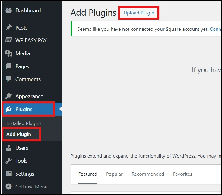
- Log in to your WordPress dashboard and go to Plugins → Add Plugin → Upload Plugin.
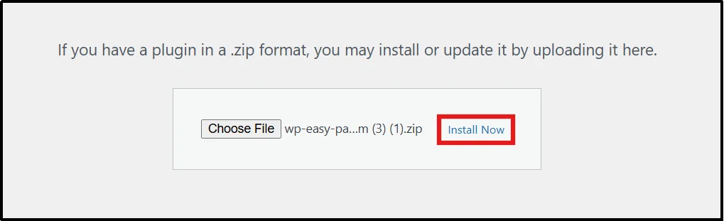
- Click on Choose File, select the correct ZIP file, and click Install Now.
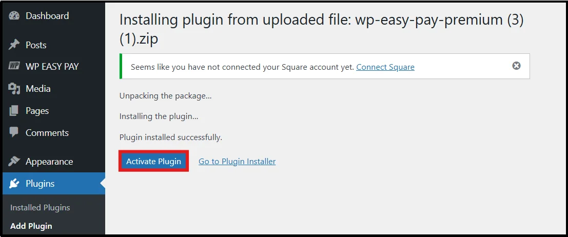
- You will be redirected to the Activation page. Click on Activate Plugin.
- Enter or paste your license key and click on Activate License.
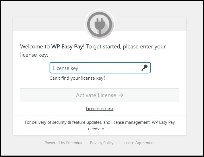
Congratulations! You have successfully installed WP EasyPay Business.
Now, let’s move on to the main steps for setting up a fundraising thermometer and donation progress bar.
Connect Square Account:
- In the WP Easy Pay dashboard, you can either click “Connect Square” or, in the WordPress dashboard, go to WP Easy Pay → Square Connect.
We recommend that you go through the WordPress dashboard method.
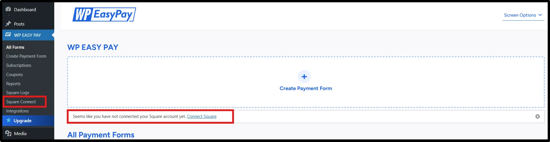
- If you click on the Connect Square link, you will head to Square login page. Else, through Square Connect, you will be redirected to another page.
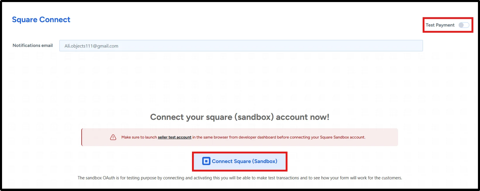
- Click on Connect Square to connect your WordPress site to Square as your payment processor. You can opt for Sandbox for testing or Production for live transactions.
- On the official Square page, enter Square credentials and click Sign In.
- Allow to securely connect Square with your WordPress site. Once you’ve authenticated, you have to click “That’s My Site – Redirect Me” to return to your WordPress site’s dashboard.
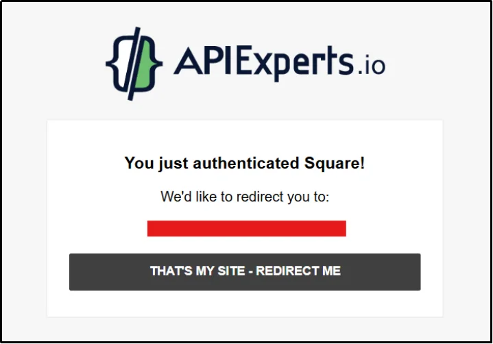
Your Square account has established a connection with your WordPress site.
Add Fundraising Thermometer
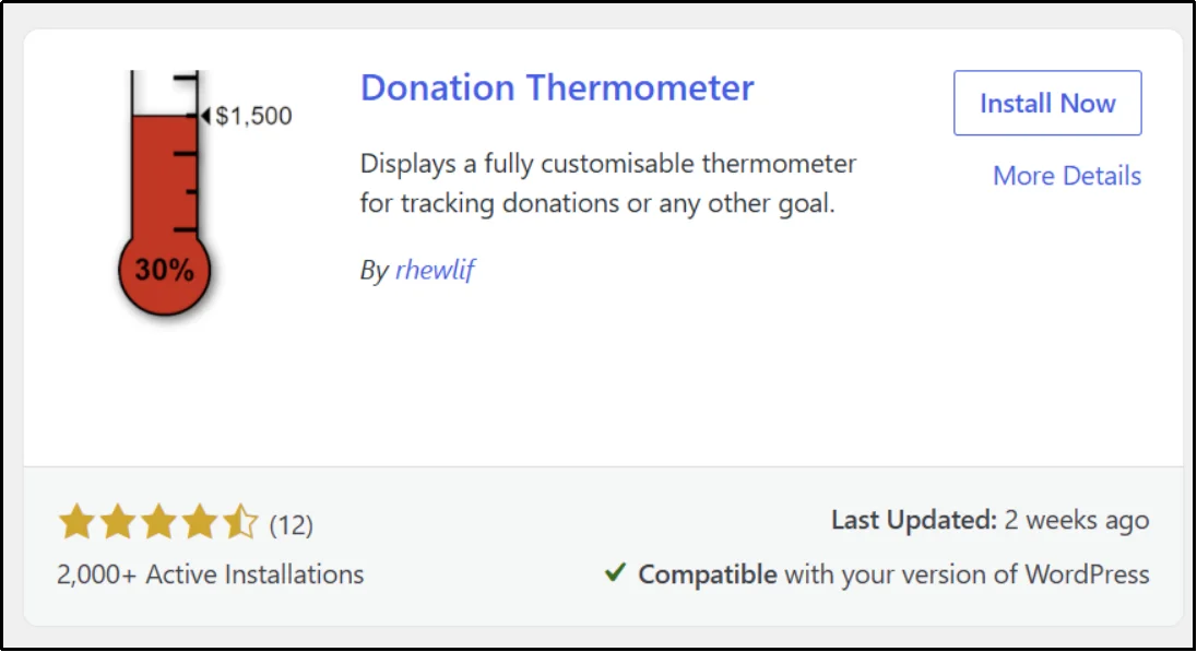
For the fundraising thermometer, we can go with the Donation Thermometer plugin.
- In your WordPress dashboard, go to Plugins → Add Plugin, then search: Donation Thermometer.
- Click on Install Now, then Activate.
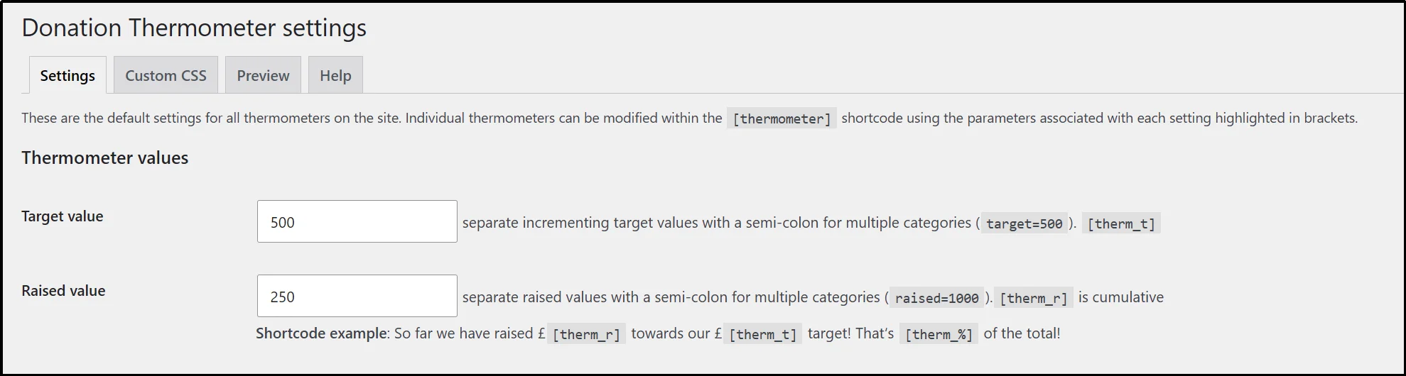
- You will be redirected to installed plugins, now under Donation Thermometer, click on Settings. Enter the target value and the raised value.
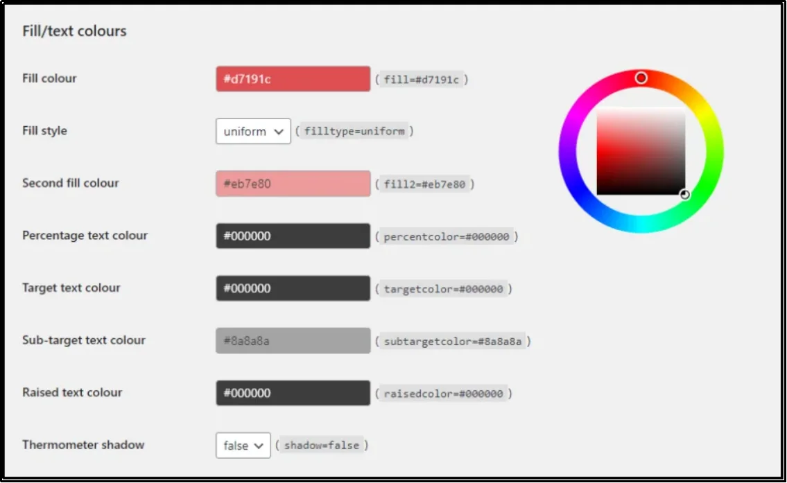
- Customize your thermometer based on your preferences.
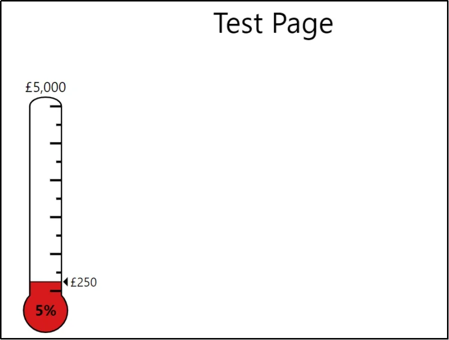
- After setting it up, go to the post or the page where you want to place it and enter the shortcode [thermometer] using the Shortcode block.

- There we go! The thermometer is right on our test page.
That’s about it!
Adding the Donation Progress Bar
Now, create a new form by navigating to WP EasyPay → Create Payment Form.
- Click on Create Payment Form and go to the Form Settings tab.
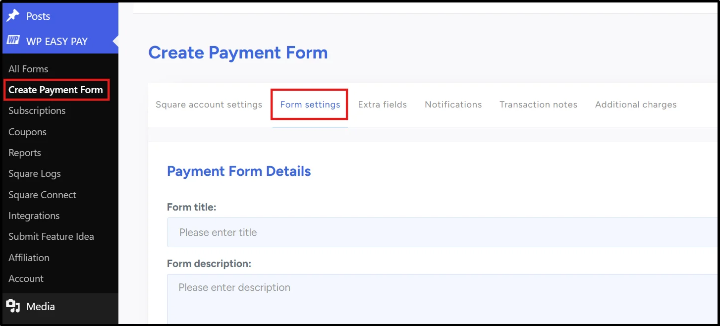
- Fill out the necessary details, including Form Name, Form Description, and, using the drop-down, select Donation Payment.
- That will reveal further details, including the Organization name, Enable Goal, and Goal Message.
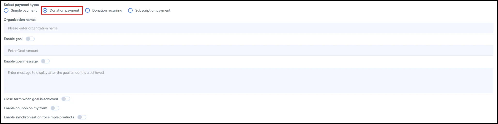
- Check the Enable Goal and Enable Goal Message options, and enter the respective goal amount and write a Goal Message.
- Finally, scroll down and select the amount type. You can set up quick donation buttons and add other fields to specify a minimum and maximum amount that can be paid.

- Once everything is set, publish the form.
You can see the shortcode here. You can either copy this code and paste it on the post/page wherever you want to paste this donation form.
- There you have it! The progress bar is live.
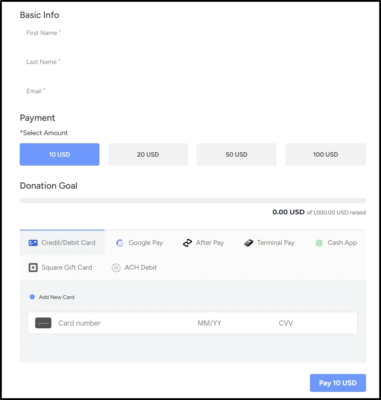
You are not limited to choosing one over the other. Both together don’t hurt either.
In fact, many organizations combine both a fundraising thermometer and a progress bar on the same campaign.
WP EasyPay and Donation Thermometer can be displayed simultaneously, allowing you to leverage their strengths without conflict. This dual setup ensures that, regardless of the visitor’s preference, they can see their preferred choice and feel motivated to contribute.
Best Practices for Higher Donation Conversions
- Set clear, realistic goals. Base your target on your organization’s fundraising history. Overly ambitious goals can discourage giving rather than motivate it.
- Keep it updated and visible. Feature the visual prominently on your homepage, donation page, and in email updates. An outdated tracker kills momentum instantly.
- Focus on impact, not just dollars. Tie the number to a real outcome “$5,000 provides school supplies for 100 children” resonates more than a raw dollar figure.
- Start with momentum. Secure some private donations before launching publicly, so the visual starts at 10–20% rather than 0%. This taps into the Endowed Progress Effect.
- Celebrate milestones. Publicly acknowledge 25%, 50%, and 75% marks. Donors who receive a thank-you within 48 hours are far more likely to give again.
- Pair with a strong CTA. Place a clear “Donate” button directly next to or below the visual.
- Optimize for mobile. Test how your visual renders on phones specifically, since a majority of donation traffic is often mobile.
- Prioritize accessibility. Use sufficient color contrast, colorblind-friendly palettes, and text labels to indicate progress. Add descriptive text for screen readers, since a purely visual/graphical progress indicator can be invisible to assistive technology.
- Use milestone markers. Small tick marks at 25/50/75% give donors visual checkpoints to aim for, reinforcing the Goal Gradient Effect at every stage, not just near the end.
- Keep design simple. Stick to one or two brand colors, avoid harsh contrasts, and make sure text (percentage, amount, goal) stays legible at every fill level.
Mistakes to Avoid
- Unrealistic goals → a target that looks unreachable discourages giving before it starts.
- Never updating the tracker → a stale progress bar signals a dead or abandoned campaign.
- Tiny, easy-to-miss progress indicators → if donors have to search for it, it’s not doing its job.
- Hiding the current amount raised → transparency builds trust; vague or missing numbers don’t.
- Poor mobile responsiveness → a thermometer or bar that breaks or overflows on phones actively hurts conversion.
- Too many colors or visual noise → competing colors distract from the one number that matters.
- Raising the goal repeatedly → if you hit your target, celebrate it. A single, pre-planned stretch goal is fine; moving the goalposts more than once erodes donor trust.
- No CTA nearby → a progress visual without a donate button next to it is just decoration.
Choose the Right Fundraising Tracker for Your Campaign
The choice between a fundraising thermometer and a progress bar comes down to style, space, and the overall feel of your campaign. The thermometer offers a classic visual, while the progress bar provides a modern look that fits easily across all devices.
To make these visuals work for you, remember the best practices. Always start your visual with some pre-secured funding to show immediate momentum and use the visual to emphasize the human impact of the funds, not just the dollar amount.
The easiest way to implement this on your WordPress site is by using a dedicated solution like WP EasyPay. The plugin integrates the payment process with the progress bar feature. This means your visual goal is updated automatically with every transaction.
Stop leaving donations on the table; implement your visual progress tracker today to turn casual visitors into motivated donors and successfully push your next campaign over the top.
Sign up with WP EasyPay today!
Frequently Asked Questions
Which is better: a fundraising thermometer or a progress bar?
There isn’t a one-size-fits-all winner. A fundraising thermometer works well for traditional campaigns and events, while a progress bar is ideal for modern, mobile-friendly donation pages. Choose the option that best matches your campaign goals and website design.
Can I use a progress bar instead of a fundraising thermometer?
Yes. A donation progress bar is a popular alternative that offers a cleaner, more modern look while showing fundraising progress just as effectively. It’s especially useful on responsive websites and compact layouts.
Do fundraising thermometers increase donations?
They can. Displaying fundraising progress helps build trust, creates momentum, and encourages more people to donate by showing that others are already supporting the campaign. The biggest impact comes from using a clear goal and keeping the progress updated.
Should I display the donation goal publicly?
In most cases, yes. Showing both your fundraising goal and current progress gives donors context, increases transparency, and motivates contributions. Make sure the goal is realistic and regularly updated.
Are progress bars better for mobile donation pages?
Generally, yes. Progress bars fit naturally on smaller screens and are easier to integrate into responsive layouts. However, a well-designed fundraising thermometer can also perform well on mobile devices.
Can I track something other than donation amounts?
Absolutely. You can use a thermometer or progress bar to track the number of donors, recurring supporters, volunteers, event registrations, or any measurable fundraising milestone.
How can I add a fundraising progress bar in WordPress?
The easiest way is to use a fundraising plugin that supports donation goal tracking. For example, WP EasyPay lets you add customizable fundraising progress bars to your WordPress donation pages without writing code.